EveryChild
EveryChild Tennessee website
background
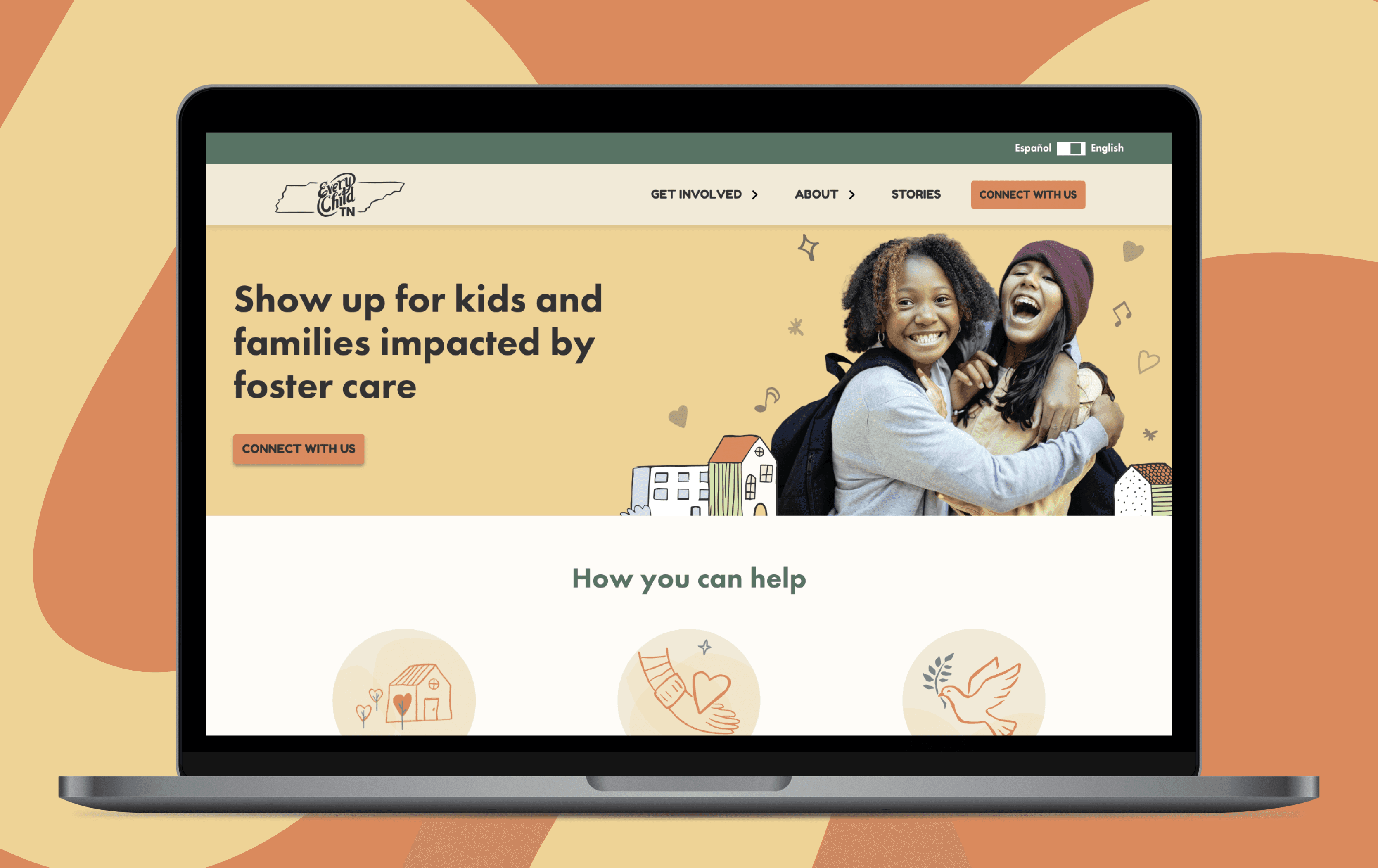
EveryChild needed a website for their Tennessee chapter. They wanted to incorporate new branding elements to make it custom to Tennessee, while using the other EveryChild websites as a blueprint. They also wanted us to improve on anything that wasn't working for their audience - potential foster families and volunteers.
problem
text
Process
TBD
Solution
TBD
Impact
text
My role
Designer (Contractor)
Interaction design, research, visual design, prototyping, usability testing, web design
Type
Web app
Problem
EveryChild needed a new website for their Tennessee- one that was custom branded for a Tennessee audience, and improved to address UX issues of their existing websites.
Impact
---
Process
Discovery & research
I did a UX/UI audit of the existing sites, to begin to understand the patterns and branding we were working with.
Meanwhile, the UX Researcher on the team organized and planned out interviews with current and potential foster families, to get a sense of what was and wasn't working on the existing EveryChild sites. My role in the user sessions was primarily observer and note-taker.
Key takeaways from discovery
The volunteer application forms, different on each site, were daunting and complicated
——-
——

Wireframes
The next step was to create low-fidelity wireframes for the team to review. In FigJam, everyone was able to easily add their contributions. The copywriter was able to add the text directly to the wireframes.

Protoypes
After the general layout was agreed on, the next step was to create prototypes.

Screenshots of solution
The launch version of the mapping tool, after we had fixed issues uncovered during testing.
Note the addition of the catch-all rule, the addition of priority indicators, the changes to the insurance panel’s headings, and the addition of the progress-tracking in the insurance panel.
