Noyo

Digitizing a manual process to unlock new clients

Noyo

Digitizing a manual process to unlock new clients

Noyo

Digitizing a manual process to unlock new clients

Overview

Two potential clients who wanted to manage their enrollments with Noyo could not do so because they were using a manual process to map their member data. The goal of this project was to put group structure mapping on our platform, as a UI-based product, so that these new clients could connect with Noyo’s API.

My role

Product designer

Interaction design, research, visual design, prototyping, usability testing

2021/2022

Problem

Smaller benefits-admin platforms tend to rely on a complex spreadsheet-based process to manually map their members into insurance carrier codes.

Doing this process manually makes it time-consuming and costly to keep up-to-date with the member changes -- and means that they can’t manage enrollments using Noyo’s API.

Solution & Impact

Noyo was able to onboard two new benfits-admin clients, using the new group structure mapping tool within the Noyo platform.

“This tool makes mapping really easy, even if you don’t understand all the carrier codes.”

– Sabrina Comins, Decisely

Process

Process

Process

Discovery: Understanding mapping

Discovery: Understanding mapping

Because none of the members on our product team had done any type of group structure mapping before, we worked closely in collaboration with folks who had done mapping.

I held several workshops to get to understand the mapping process, and also to see in their own words (and drawings) what an ideal mapping tool might include.

Key takeaways from discovery

Key takeaways from discovery

The process requires custom variables and conditionals.

Manual mapping includes a lot of copy and pasting.

The person doing the mapping often didn't know what the insurance carrier codes meant, so they needed to refer to other data sources.

Prototype validation

Prototype validation

After several rounds of iteration, we landed on a UI.

I turned it into a clickable prototype, and then I held usability sessions to test out the prototype with internal and external stakeholders.

My research questions

My research questions

  • Could users accurately map the data?

  • Were we missing any functionalities?

  • Could people new to mapping use it?

  • Did we address the manual-workflow friction points we found during discovery?

  • Were there any friction points in this UI?

Key results from prototype validation

Key results from prototype validation

100% of participants were able to complete mapping accurately, including those new to mapping

We would need to add a catch-all rule, and also some rules took higher priority than other rules

We uncovered some friction in this UI to address:

  • Participants needed a clearer way to track progress of values they already mapped.

  • For some participants, it was not immediately clear what the right-hand side was until they started using it.

We had addressed the manual-workflow friction points discovered during research:

  • By providing the relevant context about the carrier codes within the panel, we had virtually eliminated the need for people to refer to so many other data sources.

  • Because they could duplicate rules, we had eliminated the need for all the manual copy and pasting of individual conditions and values

Screenshots of solution

Screenshots of solution

Screenshots of solution

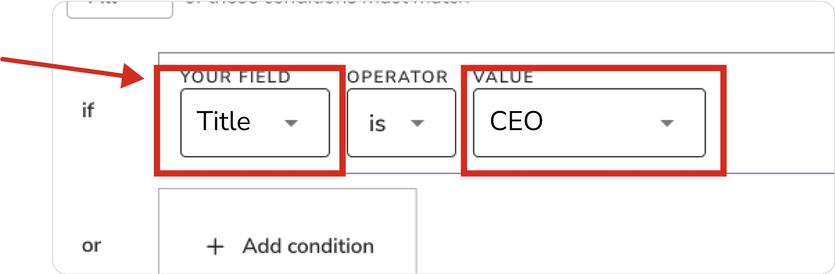
The launch version of the mapping tool, after we had fixed issues uncovered during testing.

Note the addition of the catch-all rule, the addition of priority indicators, the changes to the insurance panel’s headings, and the addition of the progress-tracking in the insurance panel.

An example of how the details for each category can help give you context as you're building rules.

Before publishing, you have to review and approve the rules you created in this summary screen.

This allows you can see the information displayed in a different way and may help you catch errors before going live.

My takeaways

My takeaways

My takeaways

Don't rely on assumptions—and always test the entire workflow, from start to finish, using real data if possible.

Users need to get their fields, field values, and plan names into the tool to populate it before they can start mapping (see image below).

At the start of the project, I had suggested building a workflow for them to do field population through the UI, but I was told that they would use the API to do it, so there was no need to build it into the UI.

The problem wasn't uncovered during the validation and testing phase because I had used mock data, so the fields were pre-populated.

Once we launched though, we quickly saw that they were unable to do it using the API, and needed our assistance to populate the fields so they could start using the tool.