
Context
Noyo is an insure-tech platform that offers both API and non-API solutions to enrollment management. The Noyo operations team reviews files every day from benefits-administration companies in order to approve or reject potential member updates from going to carriers.
The reviewers need to make decisions quickly and with confidence so that enrollment data is accurate at the insurance carriers as soon as possible.
Process
Discovery & Observation
How could we reduce the time needed for a review?
Why did it require such a high learning curve? What made it so that newer reviewers struggled with the tool?
What types of decisions can be automated? Which can't?
What things about the tool really bugged the reviewers?

I created a plan to interview and observe members of the Ops team.
I interviewed each team member them their experiences with the tool, then asked them to review between 3-4 files while I observed.
After all sessions were done, I synthesized my findings to present and discuss with my team.
Designing & Iterating
I explored a few directions, reviewing each with my team and our stakeholders for feedback. This included reviewing with upper management.
Once we landed on an iteration that we felt addressed all the problems discovered during the observation phase, I worked with the engineers to get it built, for testing.
Usability testing
I met with users individually, asked them to review a file in our new tool, and then the same file in the existing tool (in alternating order) so I could observe.
I also asked them questions to get a sense of how they felt using the new tool.
We opted to test using the actual tool, instead of using clickable Figma wireframes, because it allowed us to quickly test real files and compare it with the existing tool.
Did organizing the updates by member create a clear narrative? Did that narrative make reviewing the file less complex?
Were we missing any functionalities?
How easy was it to use for newer Ops members?
Which tool made file-reviews faster?
Were we displaying enough contextual information?
Could users track their progress in this tool as intended?
Was the information more scannable?
Were there any friction points in this UI?
Problems & Solutions
The problems found during observation and the solutions for solving them, validated by usability testing.
Problem: Missing narrative
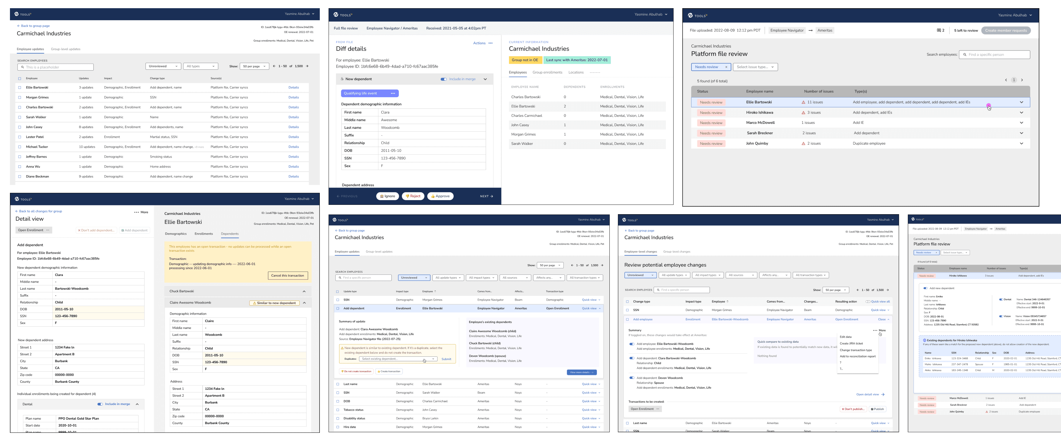
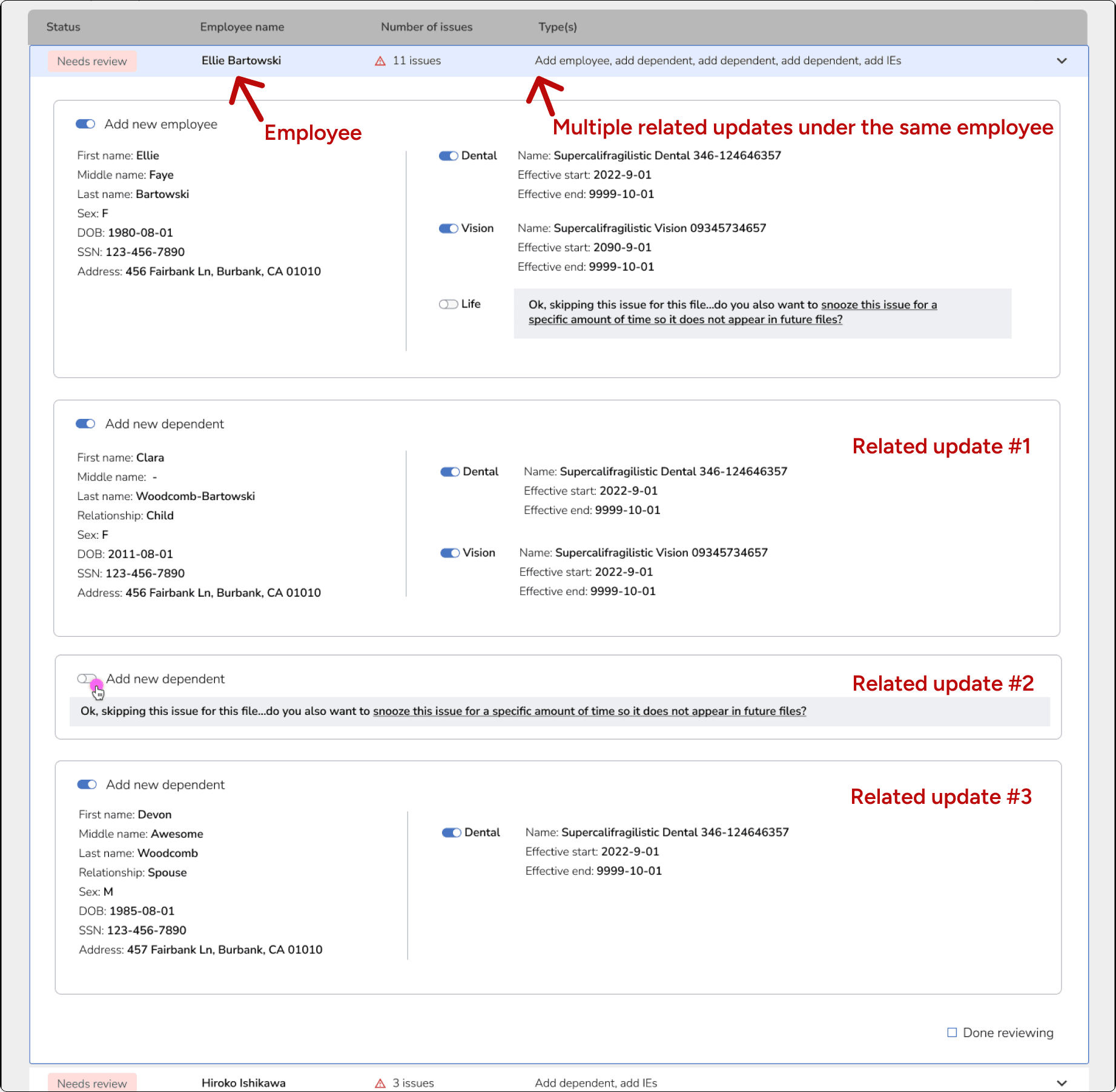
Organizing by "type" of update made connections of related updates hidden behind tabs, which made it difficult for reviewers to confidently and quickly scan for a narrative to make decisions with.
Solution: Group related updates together
Organizing by employee created a narrative that connected related items under the same update, and thus allowed reviewers to easily scan for a narrative to make decisions.
I also grouped updates according to a hierarchy - updates that could only be approved within another update (such as adding enrollments for a new member) were grouped underneath that top update.
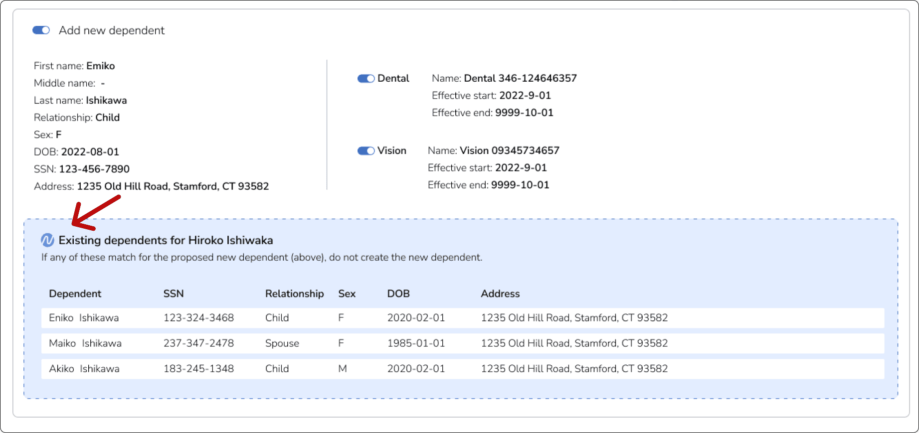
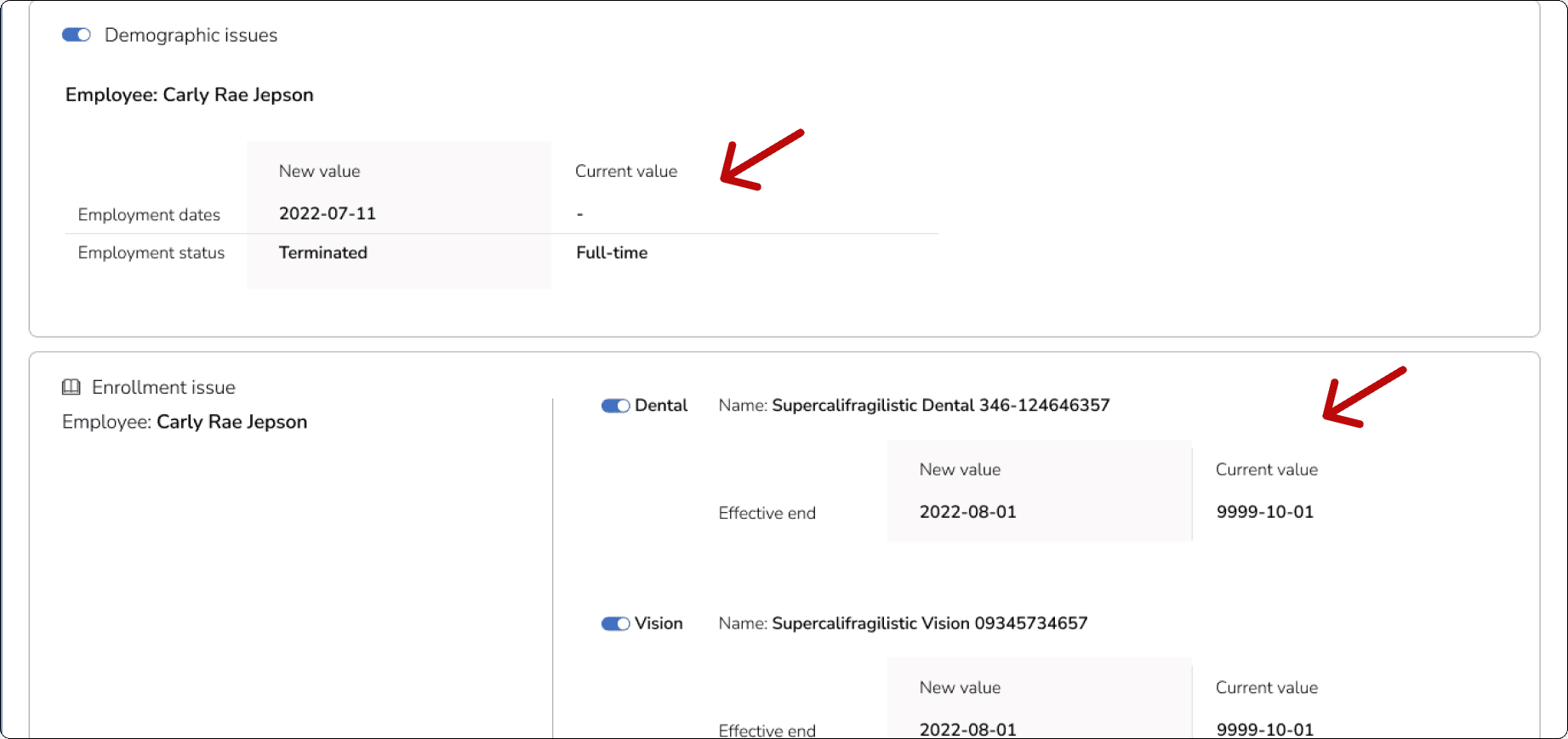
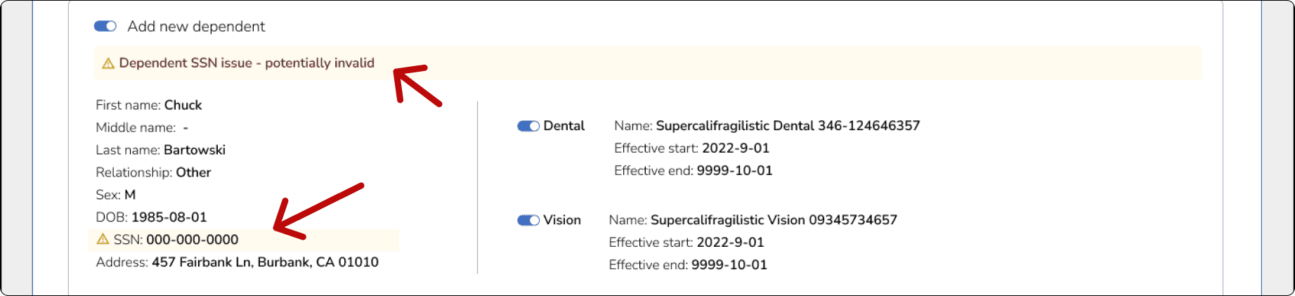
Problem: Hidden or missing context
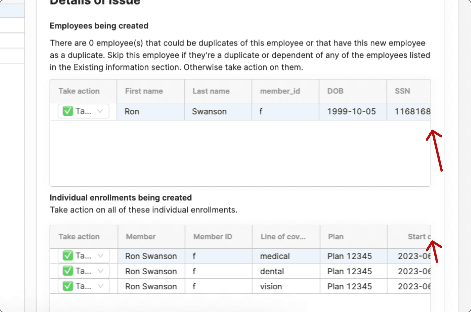
Sometimes, relevant information about enrollments was missing, which meant that users needed to have multiple apps open in order to find that data.
Other times, the data would be hidden within the table, requiring a lot of horizontal scrolling to read it. And not all the data in the table was even useful for making a decision.
Solution: Display contextual data, show in full-width
The new app displays the right amount of contextual information for users to make a decision about an item. It also uses the entire width of the screen, as opposed to a third of it, to show that data.
As a result, reviewers no longer need to keep multiple reference tabs open, nor do they need to scroll horizontally to hunt for data.
Participants especially loved to see the side-by-side view of "current" and "new" enrollment data.
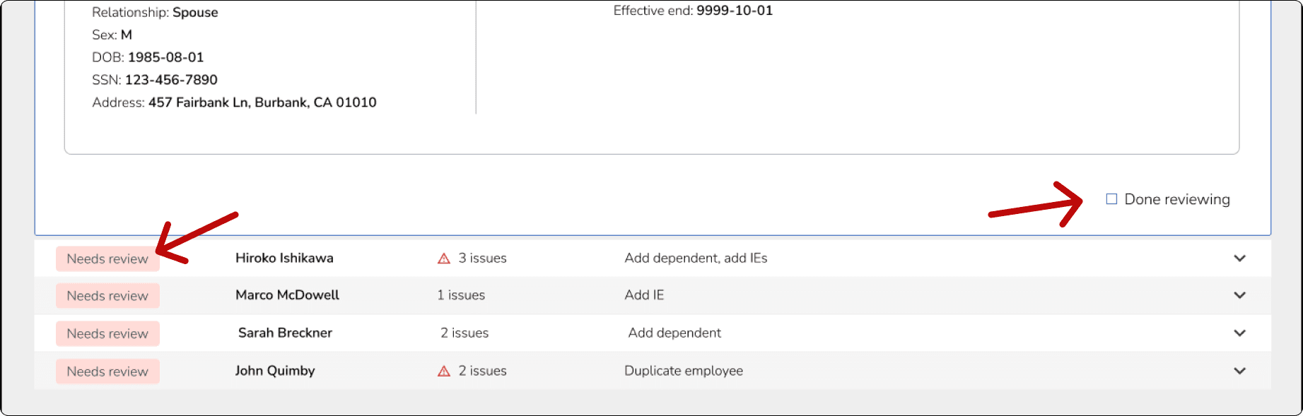
Problem: Progress frequently lost
The way to make a decision in the app was to check this box on or off, and they loaded "on" by default. If you lost internet or got distracted, you had no way of knowing if a box was checked due to making a decision to keep the item, or checked because you hadn't reviewed it yet.
Participants told me it was frustrating to start from scratch each time.
Solution: Add progress trackers and review statuse to updates
We added a checkbox to let the reviewer indicate when they were "done" reviewing a group of updates, and a status for each grouping that changed when the box was checked.
Problem: Not enough guidance about rules in-app
New reviewers would ping their managers very often with questions about rules, how to make decisions, and other related questions.
Solution: Highlight potential issues, add helpful tips and rules
We added tips and hints throughout the UI to answer common questions, highlight potential problems, and provide guidance about how to make decisions. Some of these tips are based on various carrier rules, which differ between carriers.


Problem: Third-party app can't do things we need it to do
Being built in a third-party app meant that our engineers could not easily maintain or update the tool, customization was limited, and it struggled with large file sizes.
Solution: Build our own tool
Because the tool was built by our engineers, it could handle large files.
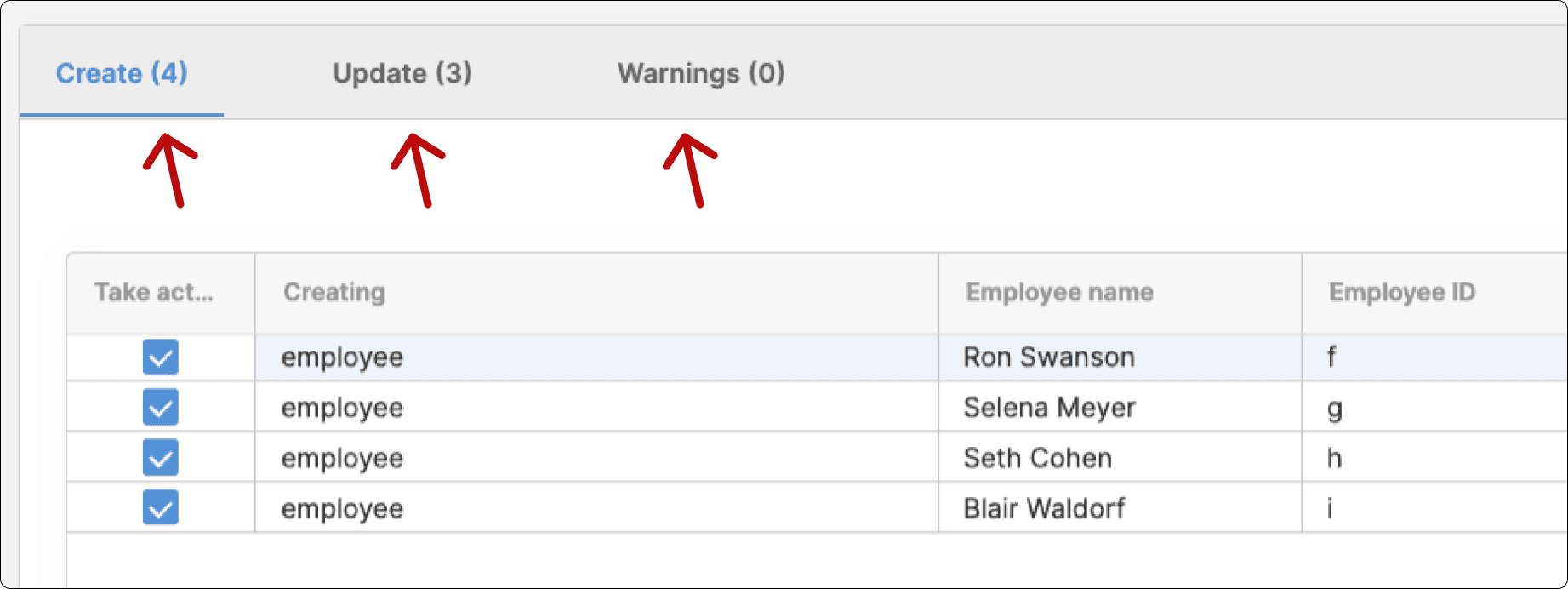
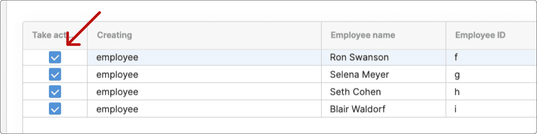
Finding: Bulk actions was needed
Reviewers were making decisions faster, but were slowed down by doing a bunch of clicking. So, after testing, we added the ability to "bulk action".
Impact
After switching over to our new tool, the operations team anecdotally reported:
Faster turnaround times.
Fewer questions for their team leads.
Less frustration.
Less of a learning curve required for new reviewers.
My takeaways
Be clear and focused about what you want feedback on, especially with leadership.
Early in the process, I had done some design reviews with leadership that I didn’t have a focused purpose for, so we ended up getting slowed down by some minor-UI discussions at a time when we should have been discussing more high-level things, such as the problem, how we wanted the tool to affect our business goals. and what our desired success outcomes for this new tool would be.